(source)
This is the first Made-Up History post in a while, huh? For the new people here who have no idea what I’m talking about, Made-Up History is a series I have been working on for a year or so where I take a piece of art that I am in deep like with and talk about it while kind of recreating what it feels like on my face. It’s not an art project where I duplicate it on my face, but I kind of distill it into a look that represents the work, or at least how I perceive it.
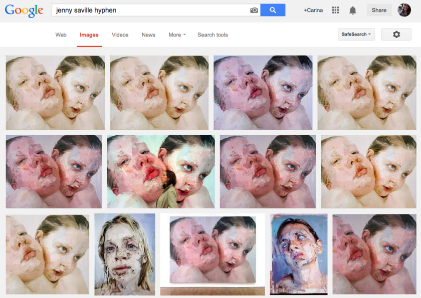
For this edition of Made- Up History, I have Jenny Saville’s “Hyphen,” which was completed in 1999. Jenny Saville is one of my favorite artists, though I’m sure her work unnerves a lot of people. I have picked a rather tame work—a portrait of herself and her sister—but she is known for depicting a lot of graphic themes in her work. I was a little wary of picking her for this because a) she might see this—far-fetched but possible, b) her work can be quite graphic and I’m not sure who is sensitive to that, and c) I don’t want to be seen as trivializing the seriousness and importance of some pieces. But. I love here. And I couldn’t seem to move past this work and do other pieces (I’ve had this idea on hold for a while), so I finally just decided to go for it.
I’m putting everything else under a cut. It’s not sick or anything, but just. Graphic. So, you have been warned. Click to proceed!
So, “Hyphen.” It’s quite hard to pick out which picture to pick, since the colors are so off in everything practically:
So, I just picked the one that has her in it and then kind of assumed that it’s the one closest to the original color/tonal quality. There is quite a bit of cool pinks and rosiness, which is where I kind of anchored the look on:
It’s a bit jarring to see how this soft look came about, when I tried really hard to make it connect with my original point of inspiration. I think, upon closer inspection, though, you can see the kind of brokenness nuances there, too. For example: the lips. This patchiness was brought to you by two OCC lip tars, Annika and Anita, as well as a matte grey eyeshadow by NARS called Bellissima. I used a lip brush and it looked like shit until it didn’t anymore. (If I do say so myself.)
The eyes are courtesy of a red gel liner (3CE in L.O.V.E.*) as a base for the inner 3rd of the eye, fading into MAC Paint Pots (Rubenesque then Groundwork), and everything all kind of gradiented together with another MAC Paint Pot (Bare Study) all over everything. I added patches of NARS Bellissima all over, too, and piled on the mascara on my upper lashes without curling them. I think I also used the Illamasqua Medium Pencil in Ascend, too.
For my eyebrows, I used Illamasqua Medium Pencil in Ascend and the & Other Stories Eyebrow Pencil (Bouclé Greige) in random flicks. I don’t know if that worked out for me, hehe.
I wanted a pretty clean, pretty pale-ish face base, so I put on the Urban Decay Naked Skin on my face as a primer and carefully applied the Too Cool for School BB Founcation Lunch Box (1)* as a face base. Then I went in with the Tarte Amazonian Clay 12-Hour Blush in Natural Beauty, with a light hand~
And that’s that! I kind of like how this look isn’t attention-grabbing until you notice the “wrong” things like the wonky eyebrows and the patchy lips.

(© Quintin Lake, source)
Anyway, what I like about Jenny Saville: her style and her fearlessness. Apart from her work, you can kind of see it in the way she carries herself. She looks like a woman who gives no fucks, and for someone like me who is very passive, non-confrontational, and insecure, she embodies the kind of person I want to be a bit more like.
As she was graduating, she held an exhibit for her senior show, which Charles Saatchi bought out. After which he offered her an 18-month contract, where he sponsors her as she creates new work that gets to be displayed in the Saatchi Gallery in London. How amazing is that?

(source)
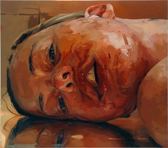
Saville is widely known as someone who paints nudes with huge fleshly bodies, but she has explored other subjects too, like transgender folk and post-surgical bodies. Her style is reflective of her desire to elicit a sensory experience from the viewer—the texture of the skin, for example—through a purely visual means because, of course, only barbarians touch paintings and other pieces of art. Barbarians.

JENNY SAVILLE & GLEN LUCHFORD
Closed Contact #13, 1995-1996
C-print mounted in Plexiglas
60 x 120 x 6 inches (152.4 x 304.8 x 15.2 cm)
Ed. of 6

Reverse, 2002-2003
Oil on canvas
84 x 96 inches (213.4 x 243.8 cm)
Extract from ‘Interview with Jenny Saville by Simon Schama:
Jenny Saville: With the transvestite I was searching for a body that was between genders. I had explored that idea a little in Matrix. The idea of floating gender that is not fixed. The transvestite I worked with has a natural penis and false silicone breasts. Thirty or forty years ago this body couldn’t have existed and I was looking for a kind of contemporary architecture of the body. I wanted to paint a visual passage through gender – a sort of gender landscape. To scale from the penis, across a stomach to the breasts, and finally the head. I tried to make the lips and eyes be very seductive and use directional mark-making to move your eye around the flesh.
Simon Schama: So you really do manipulate what’s in front of you through the mark-making. It’s very striking – I’m looking at a photograph of your transvestite painting Passage and that passage that moves from the penis and balls to the belly is really about the anatomy of paint as it constructs the body.
Jenny Saville: I have to really work at the tension between getting the paint to have the sensory quality that I want and be constructive in terms of building the form of a stomach, for example, or creating the inner crevice of a thigh. The more I do it, the more the space between abstraction and figuration becomes interesting. I want a painting realism. I try to consider the pace of a painting, of active and quiet areas. Listening to music helps a lot, especially music where there’s a hard sound and then soft breathable passages. In my earlier work my marks were less varied. I think of each mark or area as having the possibility of carrying a sensation.”

(© Bryan Adams; source)
For more Made-Up History, click here.
Follow me: Bloglovin' • Twitter • Instagram • YouTube • Facebook


looking clean and flawless! You definitely got the look on the lips! amazing
Thank you Roothana~!
Amazing!!!
😀
I love this series because I’m getting schooled on Art as well. Always leave your blog a little bit more cultured 😉 I’ve always been interested in Art & History but am too overwhelmed that I dont know where to begin. This series, I definitely enjoy! Don’t stop, Carinz 😀 *no pressure*
Aww, thank you Shari! I really appreciate it. 🙂 I miss learning about art, so eto na rin yung mild research ko for the stuff I like. Hehe. I won’t; favorite ko talaga ‘to! Time sucker lang minsan hehe
God, I love this series so much.
[cue wall of text]
To be honest, I found your interpretation of that piece to be quite…lacking. The cheeks were too blank and the shimmeriness(?) of the eyeshadow, I found, is what ‘subtracts’ from the ‘strength’ the patchiness of the lips exude. Also, what’s wonky about those perfectly-shaped brows? (If you were gunning for wearability, you efff’in nailed it. Even with the patchy lips.)
That said, I love how this series always ends up being more of art education than pure vainglorious gratuitousness. (Not that it’s a bad thing.) It’s just…like, the Internet is an abyss of images. The circulation of a piece of art is at such a pace that it is harder to appreciate it in full. But this series just brings everything into focus. And, I think, the fact that you/we played with make-up beforehand makes it easier to digest what that piece of art is all about.
Agh. I’ll stop talking now.
(P. S. Your hair color makes for a most sumptuous~ frame.)
No I get ya! Hahaha I actually feel the same way. I feel like I should have used matte/cream stuff for the eyes! The brows have stray “hairs” drawn haha. I didn’t want to make it look ogre-y. :)) But yes, ultimately, I wanted a bit of wearability! I didn’t want it to be too costume-y and literal, though I do agree with the eyes, yes.
Thank you so much for reading. I feel like these posts are some of the least viewed/read, but I like making them the most, so I appreciate it when people actually read them. 😀
Hehe freshly shaken about from a bun!
You captured this perfectly- It took me a while to figure out something was amiss with the eyebrows and lips. I sat there thinking, “Something’s different…” 🙂
Thank you Olivia. It worked! 😀
I think the patchy lips made the look. I’m not familiar with Saville’s work (and I’m mostly an idiot when it comes to paintings/art/etc) but I think you created a wearable look inspired by her provocative work.
Thank you Krysty~ 😀 She’s so awesome huhu. I love her work so much. Everything’s just so powerful, and sometimes I feel like I, on the other hand, just make stuff up to say. If that makes sense.